Wednesday, January 30, 2013

Stage Makeup Problems - No contouring

This is a less well-known thing for stage makeup: contouring. I won't spend much time here mentioning how exactly you do it as I'll cover that in-depth in a separate entry. However, if you've ever watched yourself in pics and wonder why you look like one solid shade of whatever skin color you have and that it's like your face is in 2D (instead of 3D), then that'd be because you haven't contoured your face.

At a minimum, you should wear blush on your cheeks. That will help somewhat with defining your face a bit more under the bright spotlights. That being said, it won't be enough: you'll need to do more definition. Just the blush will be a stripe of color in a sea of same color.

Contouring involves using shadowing and highlighting to essentially redraw your face.  And, yes, you can modify your features that way. If you've ever seen drag queens, they will modify their jaw line and make it less square (so less manly) by shadowing it.

At a high level,

  • for shadowing, you'll want to use a dark color (browns or bronzers work well for this) and apply it under your cheekbones, along the sides of your nose, under your jaw line. Essentially, you're putting shadows where shadows would normally be on your face.
  • for highlighting, you'll want to use a pale color, generally a bit shimmery (it can be a beige or a mellow white) to highlight above the eyebrows, on top of your nose, the top of the cheekbones, maybe even the tip of your chin. Essentially, wherever you catch a sunburn, that's what you would highlight.

Doing all of this will help you look less like one color overall and get back to a normal 3D look. Now, it's especially important if you will be under bright spotlights and if you will get your picture professionally taken. If it's a performance setting without bright spotlights, you won't need to do this nearly as much but, with the distance between you and the audience, your face will look a little flatter so it's not bad to do it... you just would contour it a bit less since people would see you from closer.

Tuesday, January 29, 2013

Starlooks January 2013 Starbox

Back in December, I mentioned that I had joined the Starlooks monthly subscription, called Starbox, because they were advertising that they were sending out palettes worth 99$ for 15$... so it seemed like a good deal. And I did say also that I was going to keep the subscription for at least one more month to see what a regular box is like. Well, I received the Starbox last Friday.

The box itself was green... and it reflected the content of the box, which I thought was an interesting thought. And those boxes are much sturdier and made of nicer material than the Birchbox. I'll definitely keep this one, especially since it didn't have those flakes in it.

The content of the box was interesting. I received
  • a green shimmery pencil (they say that you can use it as an eye shadow base or as an eye shadow or as an eyeliner);
  • a brown pencil (they say that you can layer it over the green shimmery pencil for an olive look or use it as an eyeliner);
  • a short, stiff, flat brush;
  • a peach colored blush;
  • a green bead bracelet.
If you tally up the declared value of the items on the website, you get way more than your 15$ worth as the total is about 46$... and the bracelet is another 15$ but they say that it is an "extra" so you could choose to count it or not.  The super cool thing is that all items are full size. No samples here! That was pretty amazing!

The card that you see in the box cover has a pretty picture of a look created with the items in the box and, on the other side, a brief explanation of the items that you've received.

I did try the shimmery pencil as an eye shadow and I really liked the color. It's on the pale side but the color is gorgeous. I wore it without a primer (shame on me!) so it didn't stay on very well but, with a primer, it's likely to hold on better.  I lined the eye with the brown pencil and it did look good. It's a typical pencil. Nothing special about it.

I have yet to try the brush but I've been wanting to purchase such a brush for a while now so I'm really happy that I received it. I also have yet to try the blush. It is a lovely shade.

The bracelet is meh but it's not by them but by a different company. It's okay. It's just not really my style.

Of note about this subscription is that, typically, everyone receives the same items. Last month, the palettes were sometimes different between different subscribers but, this month, everyone received the exact same items.

I was all ready to stop this subscription after this month but I was actually very happy with the box so now I'm on the fence. We'll see.


Monday, January 28, 2013

Sparkly tribal makeup


This is one of my favorite and most versatile makeup for stage.  I wear it for vintage looks and for performances with my Improvisational Tribal Style (ITS) dance troupe, Black Rose Caravan. It's especially useful when I need to perform both with Black Rose Caravan and solo during the same show as, again, this makeup is very versatile.

Here's how I did the version that you see here:
  1. I applied Shadow Insurance by Too Faced all over the eyelid to the brow bone, including at the lower lash line. 
  2. I applied the Glitter Glue by Too Faced on one eyelid then proceeded to step 3 for that eyelid... and then repeated 2-3 for the other eyelid.
  3. I applied Glamour Dust in Glampire by Too Faced all over the eyelid.
  4. I applied Stay There shadow by Buxom in Mutt at the lower lash line.
  5. I applied MAC eye shadow in Concrete at the crease and at the outer corner of the lower lash line.
  6. I applied Sephora eye shadow in Aspen Summit (it's been discontinued now... it's a white eye shadow) at the brow bone and at the inner corner of the lower lash line.
  7. I lined the upper eyelid with the black cream liner by e.l.f.
  8. I applied a thin line of black cream liner at the lower lash line, not going all the way to the inner corner.
  9. I lined the lower lash line waterline with MAC Eye Kohl in Fascinating.
  10. I then applied black mascara and false lashes.
The above application will yield a more vintage look to the makeup, which is what I wanted with that costume.  If you want an even more vintage look, you simply skip lining the lower lash line in black; for a vintage look, there should be minimal lining at the lower lash line... heck, you could skip it entirely.

I'm sure that the idea of applying white liner is scary (and the thought is for sure) but it brightens up the eye area quite a bit. It's pretty neat. You can use it for other makeup ideas as well.

If you want to have a darker look, then you simply line your lower lash line waterline with all black liner.

Friday, January 25, 2013

Split eyelid application


In the last entry, I talked about the basic "layered" application. This time, it's a split eyelid (again, my terminology) application.  There are a number of considerations to keep in mind while doing this technique... but it can be a nice change from the same old application.

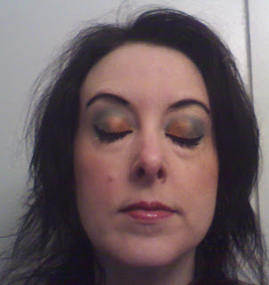
(In case someone is wondering, I used 2 top colors from the upper right corner of the Starlooks palette that I received in December.)

Basic principle
Why I call it "split eyelid" is that you're essentially splitting the eyelid in two (or three) sections. The size of the sections will change the look of the makeup and can even change the look of your eyes. So you'll want to  try it out first and see whether it's the look that you want or if it is changing your eyes too much.  While you can use a light and a dark color for this application, I find that the best use is for using 2 medium colors together.

Inner corner color
You'll want to apply a light to medium color either all over the eyelid or from the inner corner up until about where the other color will start.  Note that, if you apply all over the eyelid, it will affect (more or less) the shade of the color that you will apply on the outer corner.

Also note that, once you've applied the second color, you may need to re-apply one coat of the first color at the inner corner to bolster it. You'll know if you need to by the look of it.

Outer corner color
For the outer corner color, you'll want to apply a medium to dark color. Note that, the darker the color, the more it will close your eyes. So if you have small eyes, you'll want to go with a medium color over a dark one.

The start of the application can be at the following typical spots (approximates, of course): halfway, 1/3 from outer corner, 1/4 from outer corner.  This is another way that you can trick your eyes into looking more or less small/big: if you wanted to apply a dark color but were afraid that it would close your eye too much, you could apply it at the 1/4 from the outer corner.

Note that, in the pics here, I applied the second color at about the halfway point.

Crease
This will totally be a personal thing but you'll have 3 options: 1) leave the crease blank; 2) bring each color into the crease; 3) use the outer corner at the crease as well. In the pics here, I did option 3.

Brow bone
I do like to still highlight the brow bone so I still apply a color on it but this is also optional.

Lower lash line
As you know by now, I like to apply shadow at the lower lash line as well for a more finished/complete look. I essentially replicate the same split on the lower lash line.  So I'll apply the first color at the inner corner up to when the second color starts on the eyelid and then apply the second color from that spot up to the outer corner.  You could bolster the either color by applying that one color all along the lower lash line.

Wednesday, January 23, 2013

Layered application

I call what I typically do for eye shadow application a "layered application." There might be a real term for that I don't know. ;)

I of course start off by applying primer over my eyelids but what do I do next?

Here's the very basic application:

Eyelid
I first apply a medium color on the eyelid. This will really be the main color that will be visible and that will indicate what the color of your makeup scheme is.  I apply this color all over the eyelid, from the lash line to the crease.

Crease
I apply a darker and/or contrasting color at the crease. The area that will be covered is from the outer corner of the eye towards the side of the nose (without touching the side of the nose). You can bring it down towards the inner corner of the eye as well but it may give the illusion of closing your eye (i.e., making it look smaller) so we generally keep the application higher.

Brow bone
On the brow bone, I apply a light color. This is really an optional step but it does make the eye look appear more finished that way... and it gives a little highlight/brightness to the eye. This step is especially important if the colors on the eyelid and at the crease were on the dark side.

Arch of the eyebrow
I sometimes will apply some white or other shimmery color at the arch of the eyebrow. This will further highlight the eye area. If you've already used some very pale color on the brow bone, you won't need to do this but, if not, it could be another way to brighten it all up.

Lower lash line
This is another optional step, which is to apply eye shadows at the lower lash line as well. I like to do this as it makes the eye look more finished, imho. When you're applying eye shadows there, though, you want to use a very light touch because it's super easy for the bristles and shadow to go in your eye... which is not fun, believe me.  I generally repeat the same colors on the lower lash line in the following fashion:
1. I apply the eyelid color all over the lower lash line (that way there won't be a gap).
2. I apply the crease color at the outer corner of the lower lash line and bring it up in the crease. That's how I flare my crease application.
3. I sometimes will apply the brow bone color at the inner corner of the eye, blending it in the inner corner of the lower lash line. This further opens your eye area.

Note that I generally will apply the color after I'm done with the original area that I applied it on. That is, I apply the color on the eyelid then on the lower lash line; then the other color at the crease and the lower lash line; etc.

Another option with the lower lash line is to use a contrasting color. This can easily brighten or darken your makeup scheme so you'll want to try the idea beforehand or risk not having the exact scheme that you thought you'd have.

Tuesday, January 22, 2013

Product Review - 'Tini Beauty Lounge

As part of the Ipsy/MyGlam subscription, I received the Nailtini nail polish in Millionaire. The color was okay, especially paired with a nice red underneath so I was happy with that. And so, for black Friday, they had a good sale (I'm forgetting how much off) and I decided to purchase some items. Instead of purchasing nail polishes, I purchased some lip products.

The 'Tini concept is cool: it's about layering items to make something interesting. So, Nailtini is about layering nail polishes and Liptini is about lips stuff. Now, of course, you can use any products to do the same thing... it doesn't have to be their brand. But their brand has been especially designed with that concept in mind.

I ended up purchasing a lot of mini lip products because, really, that's plenty of product.

Since then, I've also received another nail polish color as part of the Ipsy/MyGlam January subscription so I got to experience another product.

Nailtini
So the quick answer as to what I think about the Nailtini products is: it's okay. It's not much different, in my opinion, as other nail products out there. The shades are interesting but nothing really that makes me say that I'd only buy Nailtini for my nails.  For the rest of this entry, I won't talk about Nailtini anymore but just the Liptini

Liptini
Now the quick answer as to what I think about the Liptini products is: omg! fun!

I think that the best thing about the lip products is the topper coats and how they can thoroughly change the color of a lip scheme. In the picture here, I'm wearing Blue Flame, which gives this blue hue to the lipstick that I was wearing.

They explain how to mix up the colors here. And they give example (or you can select your colors) here. I used the latter link to figure out which colors that I wanted to purchase.

So, again, the beauty of the whole concept is that, with a few products, you can easily get a multitude of options. It's very neat. And so much fun. I still need to play with it more.

It is a little on the pricey side. So thanks to my Black Friday discount, it made it more affordable. The mini bar collections are at about 8$ for each product. Those are what I purchased. The full size products are 18$.

Would I purchase at full price? Well, at full price, I'd keep getting the mini ones as, that way, I can purchase more color choices that way. And, well, if Ipsy/MyGlam keeps sending those 'Tini Beauty Lounge products, I'll keep getting discount codes. ;)

Monday, January 21, 2013

Product Review - Stila All Over Shimmer Liquid Lumizer

I received the All Over Shimmer Liquid Lumizer in Bronze by Stila as part of my Birchbox subscription. Here are my thoughts on it.

When I received it, I did a bit of research on what it is, what it's about and all.  They said that you were to apply it with the brush (think it's like a nail polish brush but bigger). Well, while, yes, you can deposit the product with the brush, you will still need to blend it in with your fingers or else you'll have warpaint-like strokes. ;)

At the first use, I loved it. I was actually going to purchase the full size. However, I noticed rather quickly that the product's glow doesn't last very long: it didn't last a full day at work. So that cooled my jets quite a bit.

Then there is the texture of the product: it's very liquidy and I thought that I was going to like it but I ended up not liking how it felt on my skin.  Now, I have dry skin so I think that this wasn't the best product for me. It would have needed to be creamier, I think.  I think that if you have oily skin, you will actually like this product as it feels cool and dries the skin a little.

In all fairness to the product, though, the color that I received was the bronze shimmer. I don't think that it's a great color for me to highlight my face. It doesn't do much for me. So, if I were to receive another sample in a different shade, I may try it again. But I'd start with a sample first.

I've still been using my sample and will use it all. But I don't think that I'll purchase it in the full size, which is 20$ for 0.5 oz at Sephora.  They do have an interesting array of shades so that's a plus for this product. I will review another product soon that I personally prefer. It's really a personal thing. If I didn't know of the other product, I would consider purchasing this one. But, as it stands, again, I wouldn't purchase the full size.

Wednesday, January 9, 2013

Stage Makeup Problems - Foundation issues

There are really 2 major issues with foundation for stage makeup: 1) not wearing any at all and 2) wearing the wrong shade.

1) Not wearing foundation
This is a common mistake as some folks don't like to wear foundation. Let me tell you, though, that it shows when you're not wearing any foundation. The purpose of the foundation is to even out your skin tone. Under the bright spotlights of the stage or even with distance, while you'd think that the little flaws in your skin would disappear, they tend to actually come to the forefront (for example, the red spots on your face will be even more prominent).

There are a number of foundation formulations available so, surely, you can find something that you'll like better. The key is finding it. If you go to Sephora or MAC, they can apply foundation for you and you can see whether you like it or not. Otherwise, you can take a chance on some products.

Foundation is definitely not something that you want to skimp on: good foundation goes a long way and you'll like it much better than a cheap one... and it will be better for your skin too.

2) Wearing the wrong shade
There are a few things about this. I think that, nowadays, most people know to check the exact foundation color on your face vs. the back of your hand. The latter used to be how people were selecting foundation but the exact shade of the skin is different between the two.

The little known fact, though, is that you should use a foundation color that's one shade darker than your skin shade. This is especially true if you will be under bright spotlights. The thing is that the brightness will make you look a shade paler... so if you're using your regular shade, you'll look a bit ghostly.  I personally play with that: I often want to have an eerie look on stage so using my regular shade (or one shade paler) will have the ghostly effect without needing to use any actual white. ;)

So if you're looked at pictures of yourself from stage and thought that you looked oh so pale... that's what happened: you needed a foundation that's one shade darker.  While you may think that a darker shade will look odd, it actually won't if you truly go just one shade darker. A good foundation brand will have minute variations that will allow you to choose something that will a drastic contrast to your natural shade.

Tuesday, January 8, 2013

Product Review - Pequi Oil

I received the Pequi Oil treatment by Couture Colour as part of my first Ipsy/MyGlam subscription bag.

When I saw the packaging, I gotta say that I thought that it looked drab and I was quite skeptical of the product.  Well, quite simply, I love it!  I have very dry hair that is none too happy that I color it and do all kinds of stuff for belly dance with it. I had heard that some oils could be good to help (I was using something else). Well, this one works great for me!

I definitely would NOT recommend it if you have oily hair, obviously. You don't need this product. If you have normal but treated hair, I'm not sure how much you'll love this oil but you very well may. As someone with dry hair, it's awesome!

When I get samples from subscriptions, I do my research to see what the product is about, how much it's worth and all that (part of me wants to ensure that I AM getting my money's worth) so I was a bit shocked when I saw that the small sample of 0.5 oz that I had received was 12$ at Sephora. That was before I tried the product. Would I pay 12$ for it? Hell yes!  But is that too small of a format? Actually, no. There is also a 2 oz format that goes for 32$ but I'm not sure how long that oil stays potent so I'd buy just the small format. Why? Because a little goes a real long way.

I put a very small amount that just about covers half of one palm and work it through all of my hair. I apply it on wet hair before blow drying (I apply other products as well) and I apply it to dry hair every other day or so. I've been using this oil regularly for about 2 months and I've barely seen the level go down in the bottle. Maybe by like 1/8? So, again, the small format seems enough for me. Granted, though, my hair is not terribly long right now.

I really fell madly in love with this product. It just makes my hair shiny enough. It doesn't make it greasy at all. My hair just soaks it up like a thirsty plant. ;)